World Top 5 Eye-Catching User Experience Websites
User experience design is a fascinating field that involves creating new products, apps, website designs & user interfaces.
The brand only can look at user experience. In today’s world without user experience this is impossible to make a brand, most probably you can generate an average scale of sales but never show it like a brand.
First, to take of new demands & provide users with the best experience when they interact with products.
Second, to ensure that brands & businesses across all industries have the tools they need to keep up with the new developments that will satisfy customers.
Where UX design take us in 2022? From new standards of personalized experience to the doors of virtual reality.
- Advanced Cursor interactions

A cursor is a fundamental web design tool that bridges the gap between the user & the user experience.
Most probably, each visitor undoubtedly interacts with, allowing them to navigate & take action on a site.
These cursor improvements are not just about impressing users with advanced design gimmicks but facilitating a more effective user experience.
The user feels more glow & smoothness when they come to the web. As a result, they can explore more products & services. This reason would be beneficial for brand advertising in a market.
Curated show recommendations from Netflix, shopping suggestions on Instagram, and pre-made playlists on shoplifting: are a few examples that prove we live in an age of hyper-personalization. Companies are more data about their customers.
Personalized user experience has intensified in the last year, and companies want to understand how they can create a total package for the user.
Designers are adapting themselves to the user’s personal needs and trying to communicate on a personal level that respects the user while producing an emotional feeling

The ability to view screen time data on our devices offers a level of transparency that makes us more accountable for our own cell phone usage. Plus, there is the invention of apps made solely to track and visualize meaningful day-to-day data.
In 2022, more brands will be on the hunt for data that can improve interaction with their products, and in general have a positive impact on users’ lives.

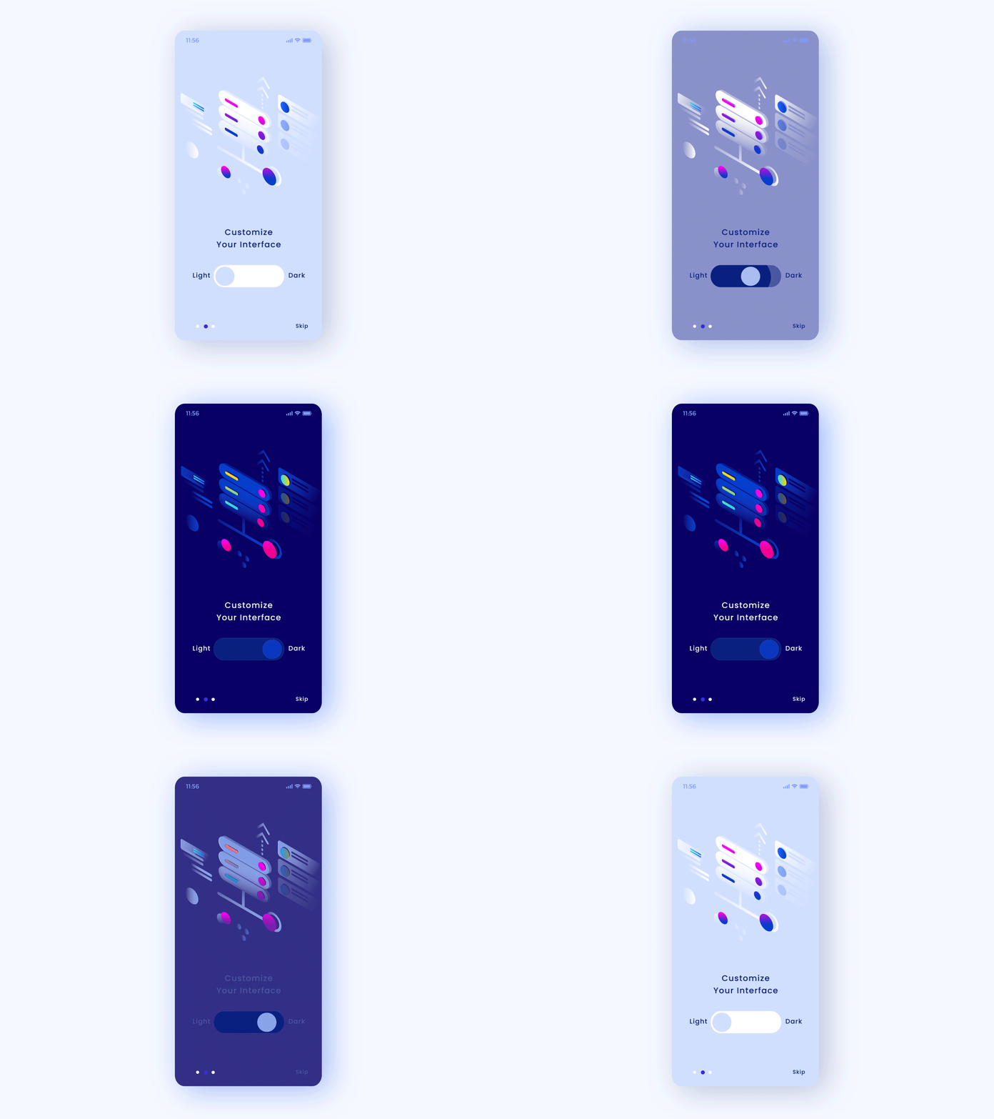
This is not a new trend: dark mode has already been used for years in programs like Apple, YouTube and Google—but it’s becoming more of a default in UX, since users and designers alike seem to prefer it.
Designers have a bias towards dark mode and the minimalistic, visual tone it has to offer. Anything that sits on black looks more elegant.” But aesthetic appeal is not the only reason dark mode is rocking the user experience.


There are many marketing strategies out there and a way to learn & pick which is best for your business is by taking up User experience courses
If you want to become a big brand and market your brand you need to understand, what people think and how they think about your relevant competitor environment.


